We’ve been delighted to work on Major Foodie since moving to our hosting a few weeks ago, and have already delivered the first batch of changes that site owner Richard had been seeking.
The changes have been about evolution not revolution: tweaking design and functionality to be easier to use, work better on a range of devices and make reviews and content east to find – all to Richard’s specification.
As examples of the changes, on the home page we’ve reworked the main image slider, making it resize nicely whatever screen size (and orientation) of device you are reading on, adding captions to each picture and a click through to the relevant review in each case. We’ve also added a bespoke styled Twitter feed to bring their very active Twitter presence to the front page of the site in a style that fits well with the rest of the content rather than a standard plug-in.
On Category pages we’ve tidied up the way excerpt content was generated and displayed, replacing them with some limited details about each restaurant. We made some amendments to the previous field structure to make this simpler to manage in the future, including moving the content to the new field structure. We’re also displaying the Michelin star rating, type of cuisine, first review date, and food rating for each restaurant.
Search is easy to put in place on a site, but rather harder to make easy to use. Previously search queries had to be exact in order to return relevant results. We’ve installed a third party plugin which connects WordPress to Elasticsearch, search engine software we already have in place on our hosting.
We think this significantly improves search: the results are more relevant and gives results for more flexible search queries: for example “Steins” now returns “Rick Stein’s Cafe” and “Rick Stein Fish & Chips”, neither of which were previously returned.
Clearly restaurants change over time, and Richard has often revisited a place a number of times to update his opinion on a place – for better or worse! That had led to making the pages to some repeatedly visited review pages a little confusing, so we’ve introduced the ability to mark up reviews easily see reviews from different dates, and also view or hide the full content.
We’ve added code to display a Google Map and the “Location …” heading automatically, reducing the time it takes Richard to add new reviews. You can see some of these in place on Richard’s review of The Fat Duck at Bray – but beware, if you are planning to visit and like surprises, don’t hit the button to see the full review!
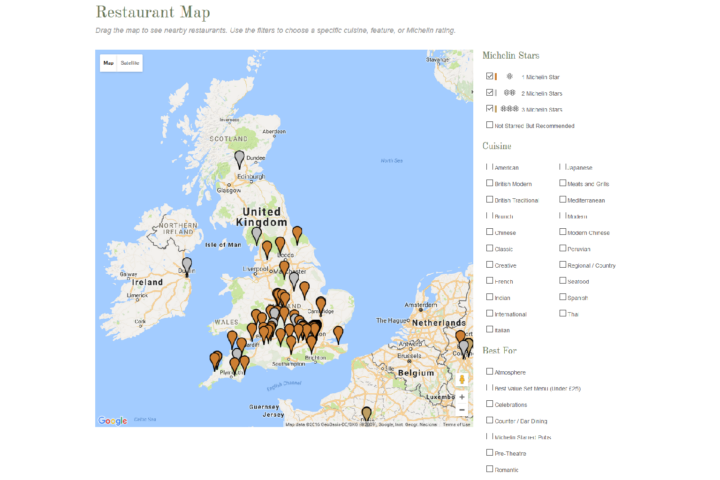
Finally, we’ve put in place a Google map on the site marking all reviewed restaurants as pins. Each pin is coloured white, bronze, silver or gold to indicate the Michelin Star status to the restaurant. Clicking on a pin opens a window with the summary and a link to the review. You can filter the map by Michelin rating, cuisine, and “best for” categories, and if you agree to share your location with the site, the map centres on your location: neat, we think!
